Data Analytics
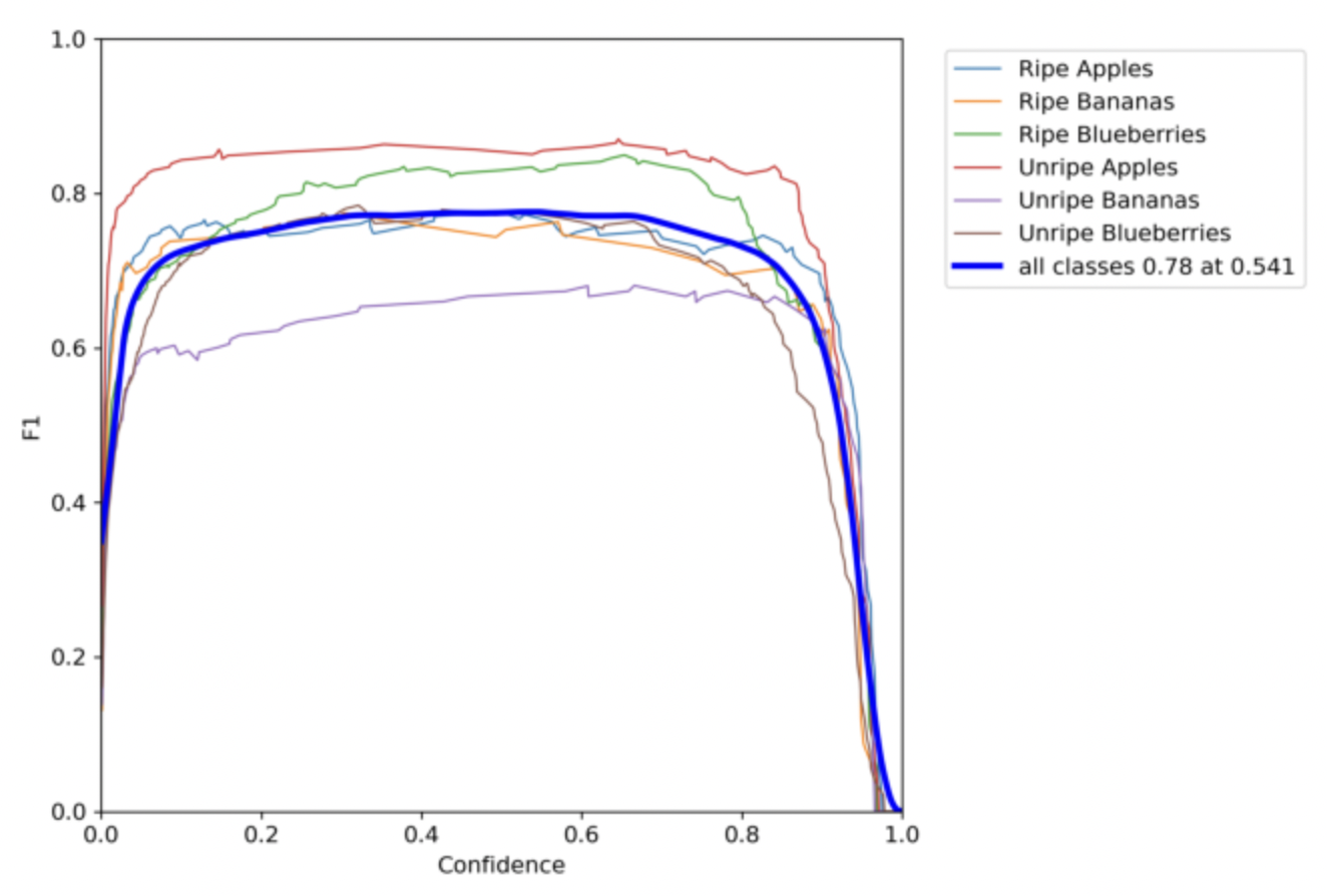
Use the arrows on the left and right side of the screen to become acquainted with descriptive statistics about our dataset, an assessment of model quality, and more!

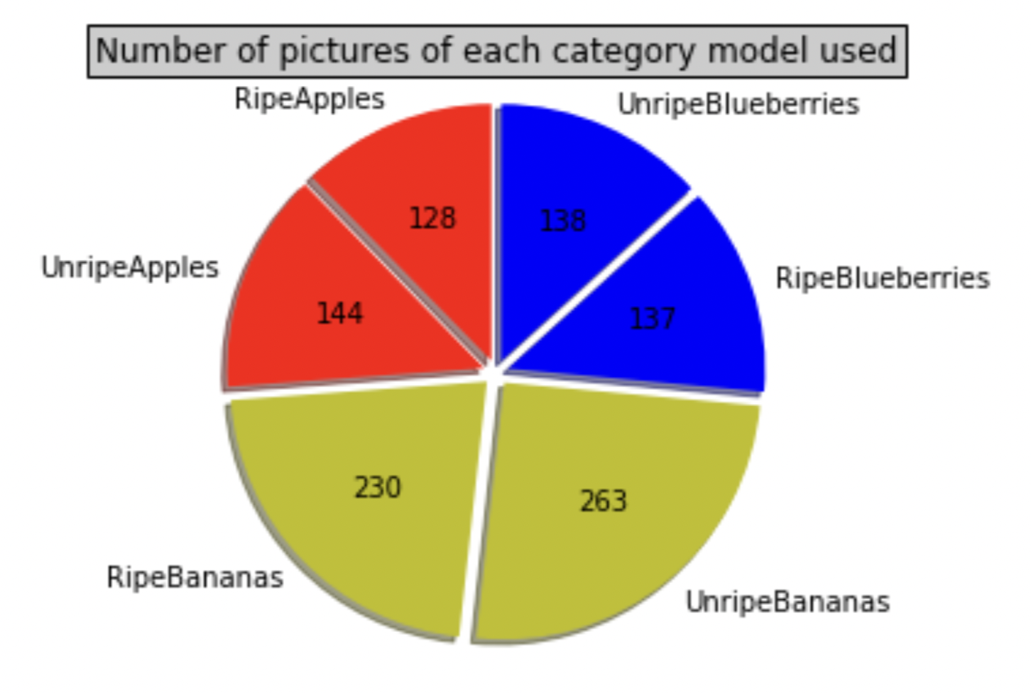
Image Distribution Pie Chart
To the left is a pie chart visualizing the distribution of images. Our team scraped images belonging to each of the shown classes using the serpAPI framework. Some images had to be discarded, like sketches or drawings. This final dataset had 1040 total images.
Instances Distibution
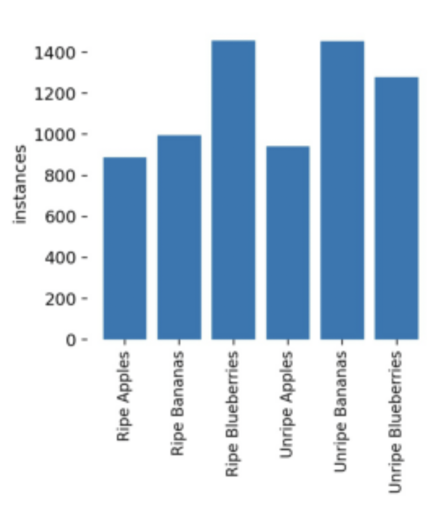
Some images had multiple instances of the same fruit. For example, some blueberry images contained dozens of blueberry instances! This serendipitous data helped our object recognition model, giving it more context to work with.
Confusion Matrix
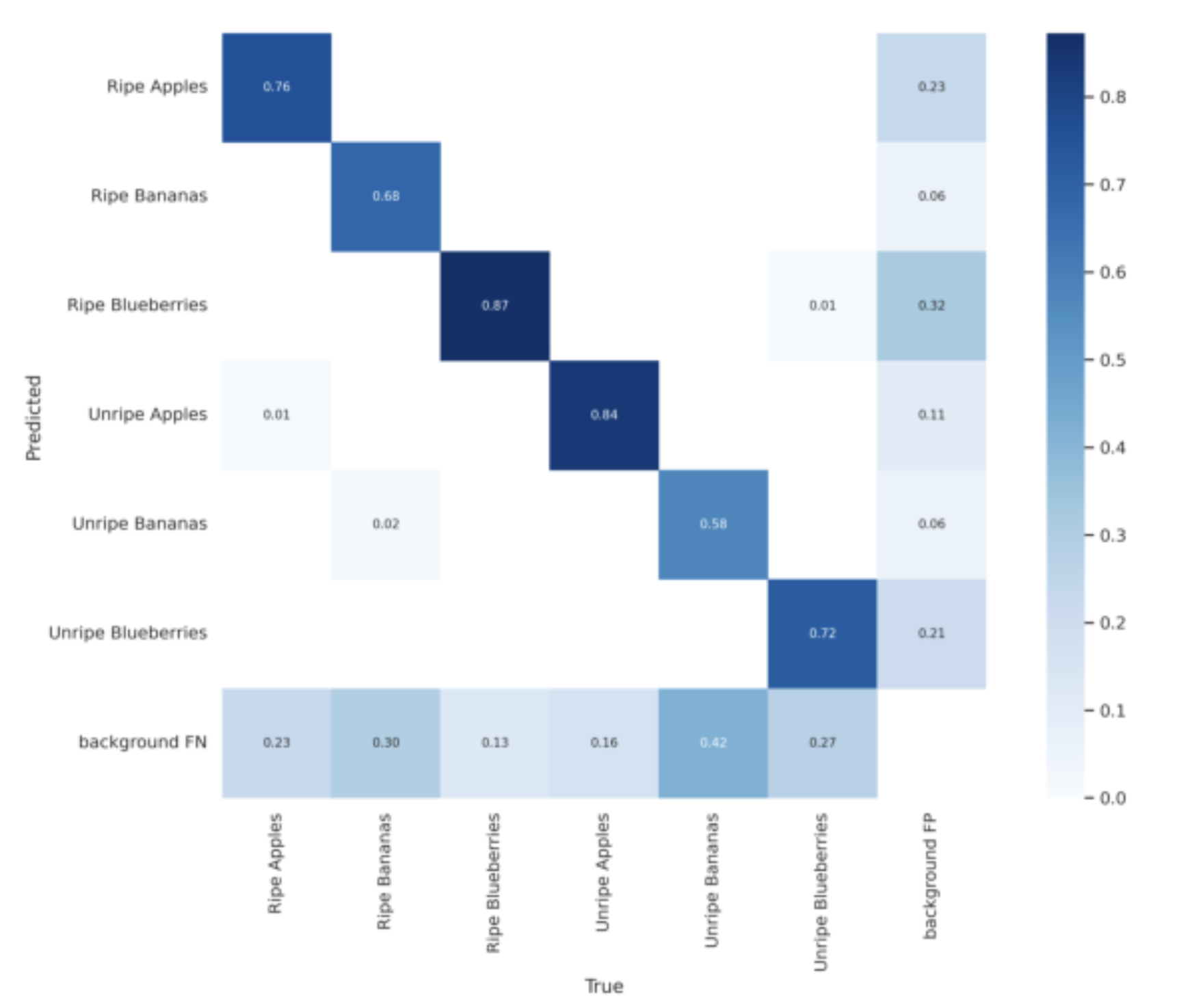
This table shows the model's performance. Fripen identifies unripe apples and ripe blueberries best but is a little weak in identifying ripe and unripe bananas. This co-relates to the instances distribution chart. The higher the instances of a fruit are, the better the model performs with that fruit.
Precision Line Graph
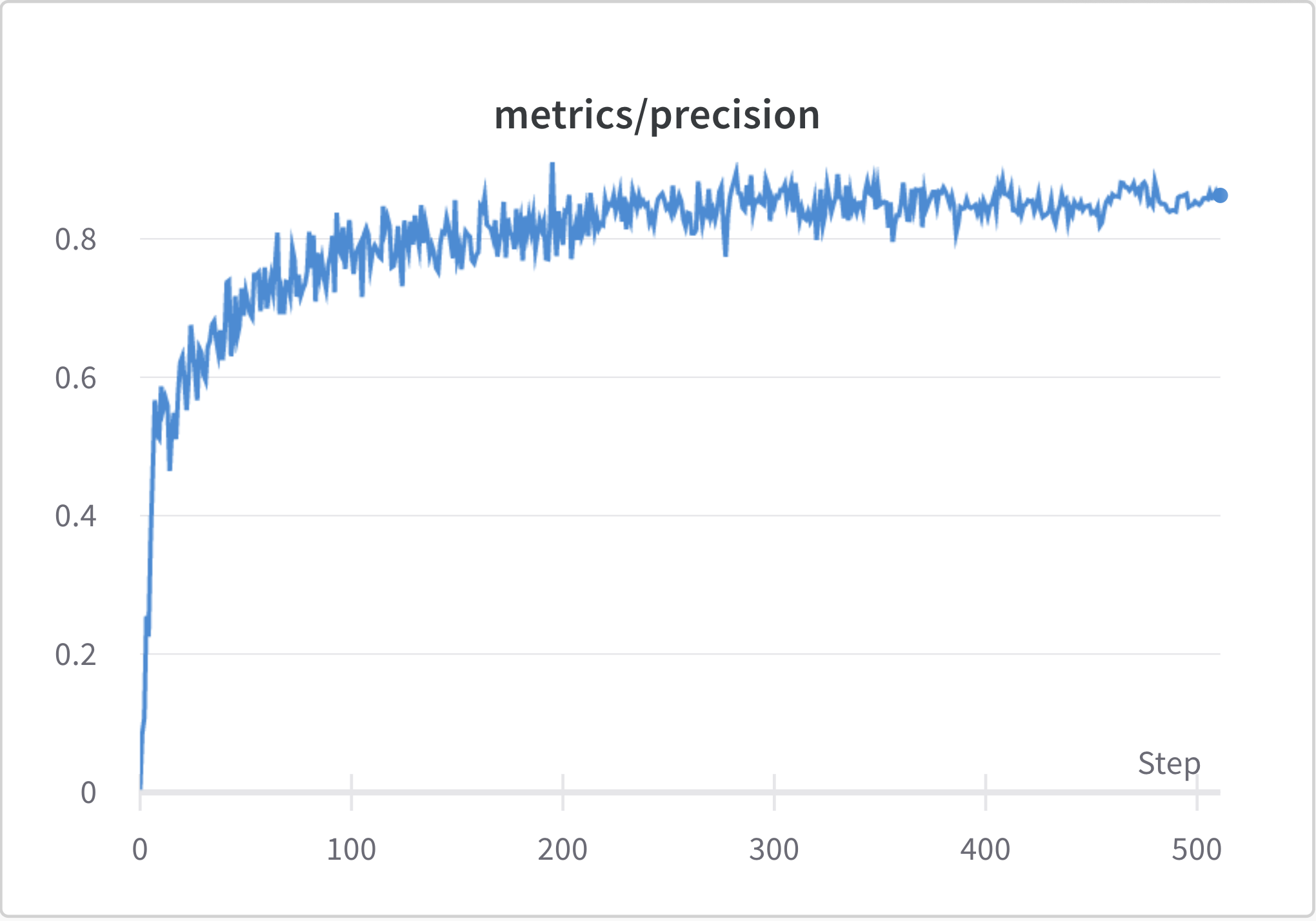
This line graph represents the number of correct positive predictions made out of all positive predictions that could have been made, during each epoch. The best results occurred at epoch 410 and since the model performance didn't improve in the next 100 epochs, it early-stopped at epoch 510
Recall Line Graph
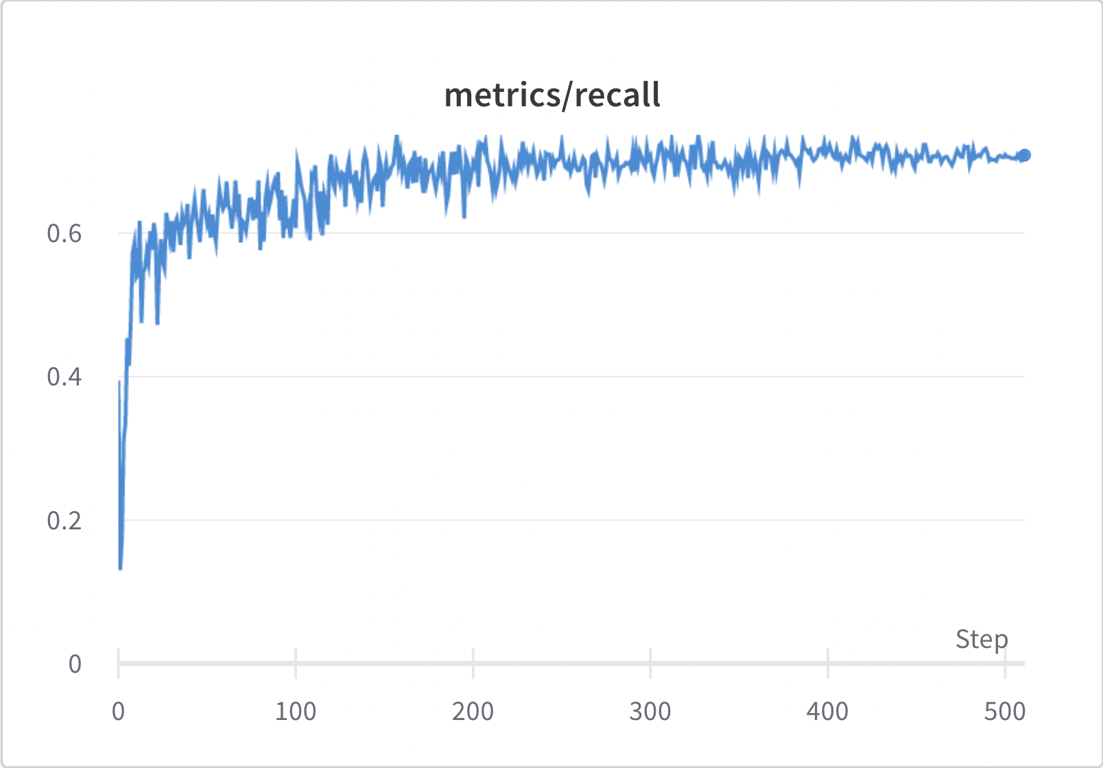
This line graph represents how the number of false negatives were reduced as the number of epochs increased. When compared to the precision it can be inferred that the model was able to reduce false positives better that false negatives.
Predictions
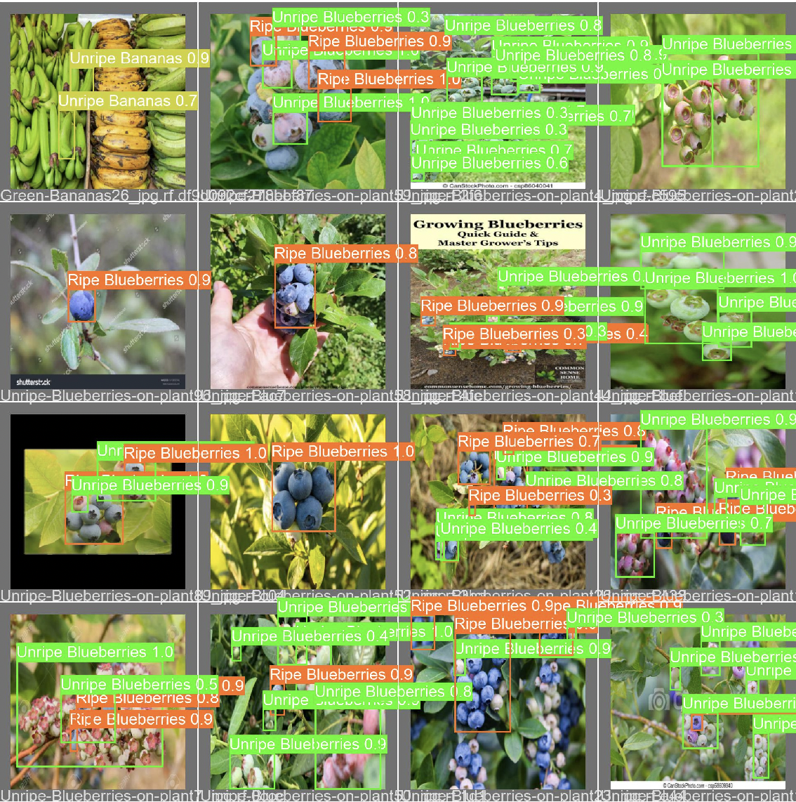
This image shows our model labeling images as what it thinks they are. The decimal above shows how confident it is with the prediction. 1 being 100% confident and 0.01 being 1% confident.
Confidence vs. Precision
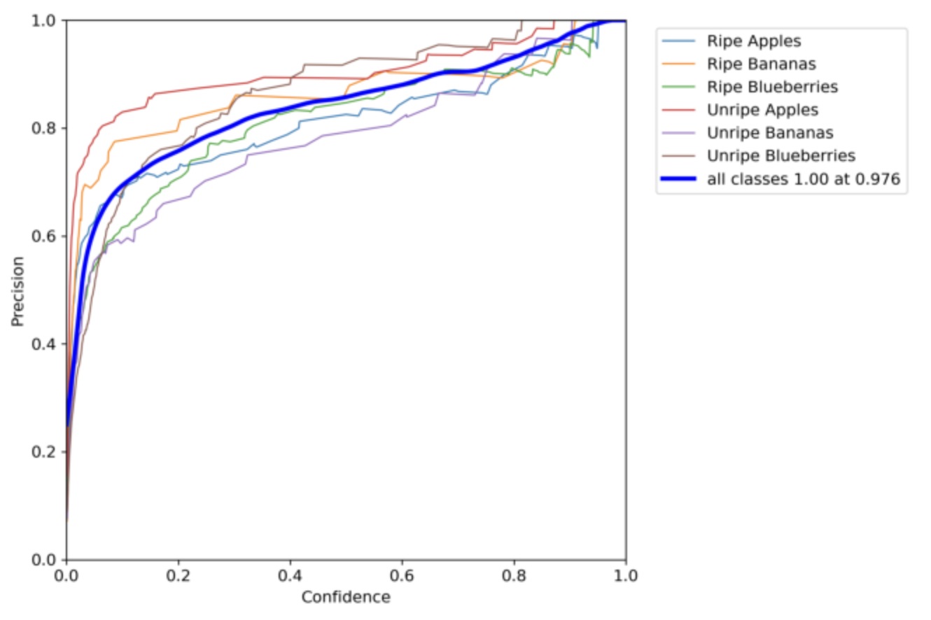
This chart compares the confidence of our model with the precision. Overall, when all the classes achieve a precision of 1, the confidence becomes a 0.976. However there are minor differences in these numbers as you analyze different classes.
Confidence vs. Recall
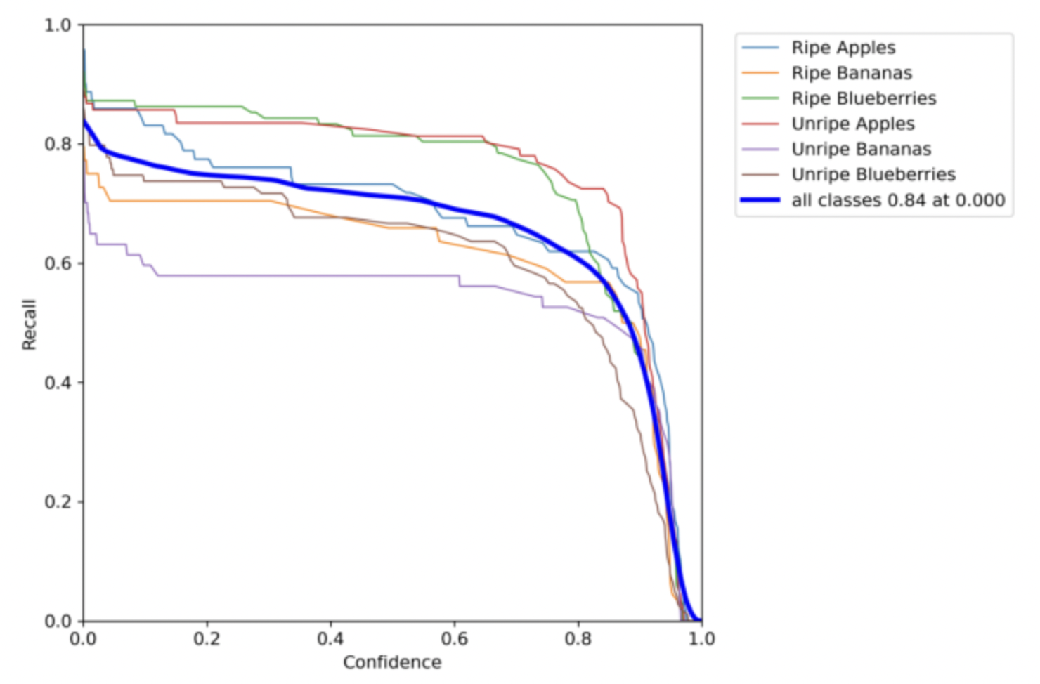
This chart compares the confidence of our model with the recall. The best recall was achieved when the confidence was 0. So, it is important to find a good balance where both of these values are somewhat good. In this chart that would be when both the recall and confidence are around 0.7.
Precision vs. Recall
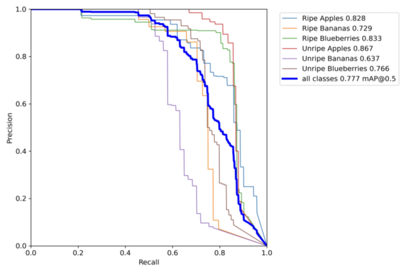
This chart compares the precision of our model with the recall. Precision and Recall are two values that are like opposites. If one is high then the other is low and vice-versa. Hence, the key is to find the perfect balance between these two as sometimes the main reason behind a model not performing well is not having good precision o recall. in our case the perfect balance between these two occurs when both of them are at 0.7.
